
Typed Tailwind Styling for Multi-Part Components
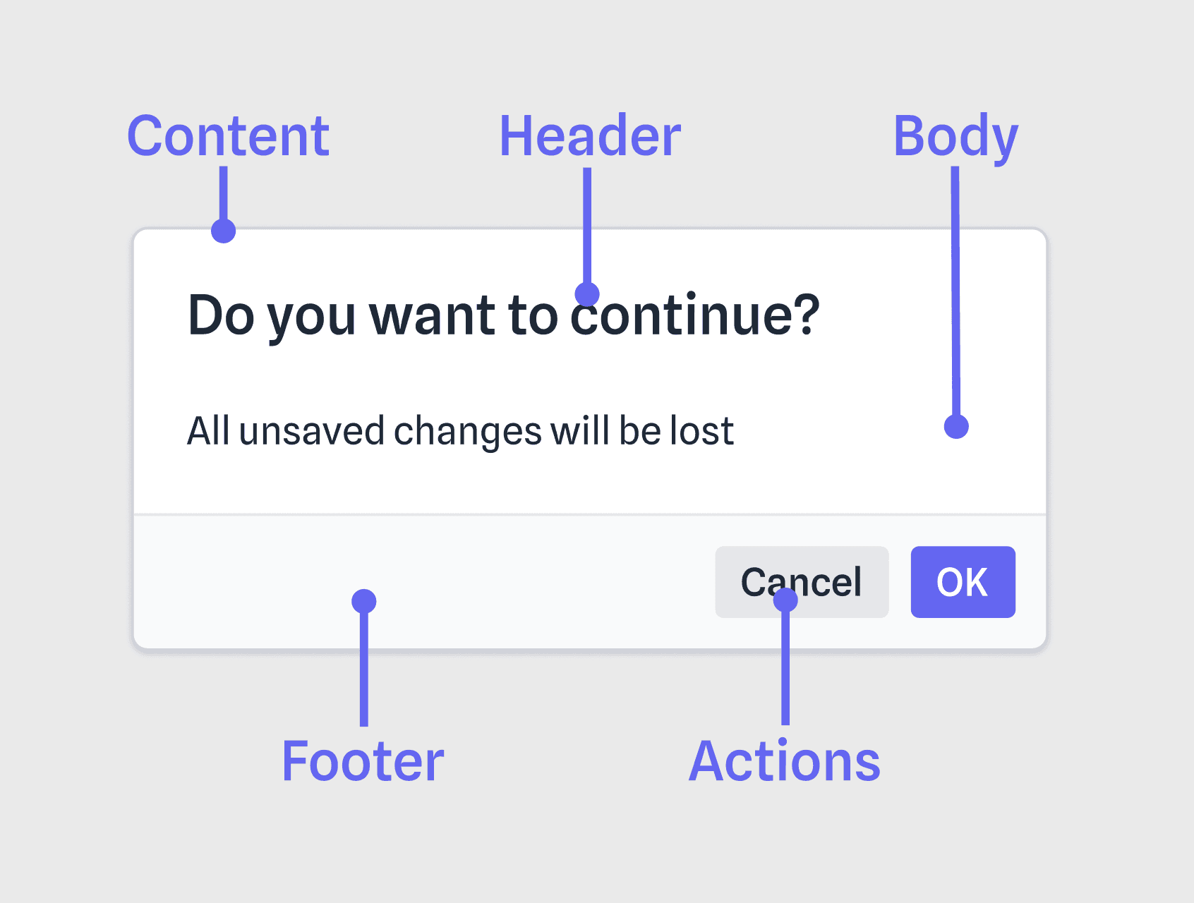
Complex components such as dialogs and menus can be challenging to style because they are made up of many parts. For example, a dialog might include a header, body, and footer.
Applying base styles is straightforward, but how can one create an error variant with a red header? Or override the body padding for a specific instance?
Let's explore a pattern that addresses these questions and improves the developer experience at the same time.
Separation of style and state
Before we get started, let’s agree on a few basic principles:
- Components should expose only one prop for style overrides.
Avoid creating separate props for each part, such asbodyStylesorhasPadding. This practice adds unnecessary complexity and makes it difficult to iterate on components. - Customizable parts should be easy to find and consistent.
Consumers should be able to style your component without analyzing source code. In addition to using a single prop, make sure it is typed to provide autocompletion support. - Avoid using conditional logic for managing variants.
When dealing with multiple style overrides, inline conditional styling can get messy quickly. It's cleaner to define styles as configuration and use an abstraction to handle the logic.
<div className={wrapper}>
  <Overlay className={overlay} />
  <Content className={content}>
    <div className={header}>{heading}</div>
    <div className={body}>{children}</div>
    <div className={footer}>{actions}</div>
  </Content>
</div>
Following these principles, we can:
- Expose a typed
classNamesprop with Tailwind completion. - Manage multiple levels of style overrides without conditional logic.
- Separate markup and styles, resulting in more readable components.
Implementing this pattern
Let’s apply this pattern in practice! This guide assumes you’re using React and Tailwind.
Install Tailwind Variants
Tailwind Variants is an excellent variant API with support for slots.
npm i tailwind-variantsDefine utility types and functions
Add the following wherever you keep your utility functions.
import { type ClassProp, type VariantProps as VProps } from 'tailwind-variants';
export { tv } from 'tailwind-variants';

type TVProps = (...args: any) => any;
type SlotFn = (config: ClassProp) => string;
type SlotClassNames<T extends TVProps> = { [key in keyof ReturnType<T>]: string };

export type VariantProps<T extends TVProps> = VProps<T> & {
  classNames?: Partial<SlotClassNames<T>>;
};

export function getClassNames<T extends TVProps>(tv: T, props: VariantProps<T>) {
  const { classNames, ...rest } = props;

  // Apply base + variant override
  const slots = tv(rest) as Record<string, SlotFn>;

  // Apply instance override
  return Object.fromEntries(
    Object.entries(slots).map(([key, slot]) => [
      key,
      slot({ className: classNames?.[key] })
    ])
  ) as SlotClassNames<T>;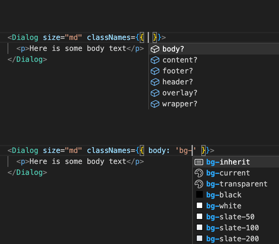
}classNames property, which is keyed by your configured slots and accepts Tailwind strings. It also exposes a getClassNames method which consumes the classNames prop and any variant props to produce the compiled styles.Set up Tailwind VSCode Intellisense
Add the following to your workspace settings file (*.code-workspace).
"tailwindCSS.experimental.classRegex": [
  ["tv\\(([^)]*)\\)", "[\\"'`]([^\\"'`]*).*?[\\"'`]"],
  ["classNames={([^}]*)}", "[\\"'`]([^\\"'`]*).*?[\\"'`]"]
]
Using this pattern in your components
Import your dependencies
import { tv, getClassNames, type VariantProps } from './utils';Create a Tailwind Variants object
Add the styles for each part of your component to slots (See the Tailwind Variant docs for more details).
const dialog = tv({
  slots: {
    overlay: 'fixed inset-0 z-50 bg-gray-900/75',
    content: `fixed z-50 w-full rounded-md border bg-background`,
    // ...
  },
  variants: {
  	size: {
    	xs: { content: 'max-w-md' },
      sm: { content: 'max-w-lg' },
      // ...    }
    },
  // ...
});cva or Class Variance Authority. The API is nearly identical: just move the first argument from the call to the base prop on the Tailwind Variant config object.Extend your component props
Extend your component props with VariantProps, using typeof the object created in the previous step. This will add any variants as props, as well as the classNames prop.
interface DialogProps extends VariantProps {
  //...
}
Consume the generated styles
In your component, use the getClassNames function to access the classNames for each slot.
const { wrapper, overlay, content, header, body, footer } = getClassNames(dialog, props);
// ...
<div className={wrapper}>
  <Overlay className={overlay} />
  <Content className={content}>
    <div className={header}>{heading}</div>
    <div className={body}>{children}</div>
    <div className={footer}>{actions}</div>
  </Content>
</div>
Use your new component
The classNames props exposes your configured slots.
<Dialog show={show} classNames={{ body: "p-0 text-center" }} />Full code example
You can play with a full code example here: https://codesandbox.io/s/tailwind-classnames-d8n6rp.
Conclusion
It only takes a small amount of setup to combine TypeScript and Tailwind to style complex components.
Here at Polytomic we’ve found it beneficial to use Tailwind Variants even for smaller components. It’s a simple pattern that promotes a clear separation of concerns.
Comments welcome on Hacker News!